.svg)
.svg)

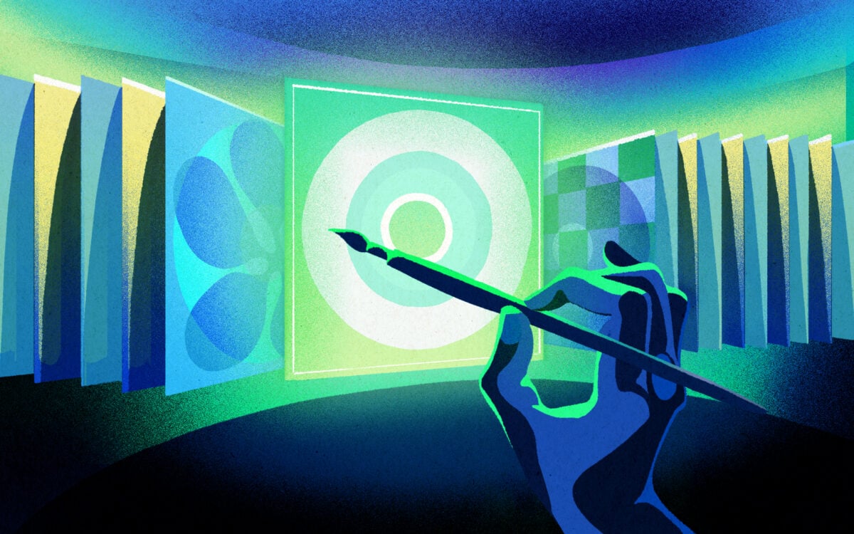
Illustration: Franco Égalité
If you don’t have a huge budget or access to an expert graphic designer to make your release look good, you can learn how to make an album cover yourself.
The way you present and package your single, EP, or album is one of the most important aspects of a release plan. We might not be flipping through vinyl at the local record store as much as we used to, but an EP or album cover still needs to make an impact, both physically and digitally.
In a world where our attention is stretched with endless scrolling, making something that will grab someone’s attention for more than a split second is the first step in gaining a new listener. Album art remains a vital canvas for telling your story and contextualizing your songs. Perhaps most importantly, it’s your best opportunity to present your whole brand as a single image.
Essentially, your visual identity is your first impression—so how do you make sure it’s a good one? After investing so much time, energy, and (probably) money into your release, you might not have a lot left to make an album cover. That said, you’ll almost definitely have an idea of what you want it to look like—and that’s a perfect starting point.
“Having a clear source of inspiration and a goal to keep coming back to is imperative to the process,” says art director and graphic designer Mira Moore. “The first thing I always start with is a mood board, which is also a great place for everyone to contribute ideas, especially if you are working with multiple people and points of view.” Aside from the usual glue stick and magazine cutouts, you can create digital mood boards on sites such as Adobe Spark, Milanote, and Canva.
Below, we go over the many considerations for learning how to make an album cover for your music, from developing a concept to keeping costs down.
What you’ll learn
- Designing for digital vs physical release
- How to keep costs down
- How to size your album cover
- What to watch out for
Let’s get started!
Digital vs. physical: Considering where your album cover will exist
Once you have a clear idea in place, consider where the album cover will exist before even starting the process. “Different considerations come with an only-digital cover and one that will be both digital and printed on a record sleeve,” says musician and illustrator Jaime Knoth. “Unless a cover includes text and size matters for legibility, I like to think that a good drawing or design will translate well at most sizes, and hopefully be eye-catching enough at tiny-screen-size to compel someone to seek out the cover on bigger screens or in a record store.”

Cover and label by Jaime Knoth for Another Michael’s New Music and Big Pop
However, even if you think that you’ll only be releasing your record digitally, it’s important to remember that you may wind up re-releasing it physically at a later date. So, how will it look on a phone screen? How will it translate to a j-card? Is this getting pressed to vinyl, and if not, might it someday?
These are all questions that graphic designer and musician Nick Levine says are important to consider before even starting the process. “Bandcamp will let you put anything up that’s 1400×1400,” he notes. “But, if that’s the highest resolution you’ve got and the opportunity someday arises, it’s not gonna look crisp when it gets printed.”
For Jon Samuels, who has created many of Dear Life Records’ artwork, it’s important to try and keep resolutions greater than 2000×2000 and DPI settings at 300 ppi. “It’s easier to make something smaller than to blow it up, even if you think it’s a garbage throwaway document,” he says. “That stuff might look cool to you in two years.”
How to keep costs down for your album art
If all this talk of resolutions and DPI is making your head spin, don’t worry—there are plenty of tutorials out there to help translate some of the jargon and get you started on the right track. Tuts+ on YouTube is a great (and free) place to learn the basics of Adobe Photoshop, InDesign, and Illustrator—programs that you’ll likely have to familiarize yourself with if you want to make your artwork look professional.
“You can definitely get away without using all of these, but they’re all helpful for their own things,” Levine says. “I use Photoshop just for image correction and sizing and lean hard on Illustrator for the bulk of it, and InDesign just for putting booklets together.”
The Adobe Creative Suite subscription can cost a pretty penny, so if you can get a copy through your school (with an .edu email address) or your employer, you can get the entire suite for a much cheaper monthly cost. You could also split subscription costs with friends and there are also pretty good free alternatives out there for Photoshop, like GIMP and pixlr.
Making your album art by hand
“You can always pause or cancel your subscription after designing everything you need too,” says Moore, adding that if Creative Suite isn’t an option, you can absolutely make your album cover by hand—painting, collaging, drawing, etc., and then scanning everything in. “I usually use a combination of scanned and designed elements, no matter what the project,” she says.
Knoth is also a champion of the handmade approach. “Making work with a combination of traditional and digital processes has allowed me to go without super nice, archival quality paint, so I like to work with the cheap stuff,” she says. “I don’t really go through my drawing and painting supplies very quickly either. Working with white gesso instead of white paint was a tip someone told me in college and it’s been pretty crucial.”

Original painting by Jaime Knoth for Another Michael’s New Music and Big Pop
How to size your album cover
In terms of making sure your album art will work as both a thumbnail and a physical LP, the simple answer is to keep referencing it at both sizes. In general, you want to work at the largest size needed for your master file, and then scale down where necessary for smaller formats (rather than the other way around).
Super fine lines or small text that look elegant at full size might not translate to a smaller format—it’s up to you to decide where to compromise,” Levine says. If it’s text or graphics-based, Moore says she makes sure to have some good contrast happening, or if it’s more photograph-based, she makes sure to choose a truly engaging photo, no matter what size you’d see it. “Always make sure you print out your work at a small and large scale (if possible) before finalizing any designs,” she adds.

LP packaging by Nick Levine for Half Waif’s Mythopoetics
Working with a physical release in mind
Samuels and Knoth are both fans of working primarily with a physical LP in mind. “Phone listening and streaming feel inherently representational to me,” Samuels says. “When these images show up, they are thumbnails that are referencing source material. You can’t control the size, shape, or resolution of the screen somebody will view the image on; it is going to change.”
“My solution to this problem is to focus on making something that makes sense to you being printed on a real product—CD, LP, or whatever. If it makes sense in a big square, it will make sense on a phone.” Knoth adds that having a physical LP within arms reach has saved her many times. “When you are unsure about how something may print or how something needs to be formatted, looking at an actual record that you like can help ensure that you are taking all the right considerations,” she says.

Natalie Jane Hill’s Azalea album cover, designed by Jon Samuels
What to watch out for when making your album cover
In terms of printing, you don’t need a super fancy model; a standard home printer will be helpful to get off a screen and figure out how your album cover will physically look and feel. But, be prepared for things to print weirdly—what looks good on a screen is not necessarily the same as what looks good on paper. “Pantones are your friend if there are any colors that you really have to get right; guides, the grid, and the align tool are all your friends,” says Levine. “I’ve also noticed that pure, bright red seems to get compressed pretty weirdly on social media, so watch out for any fine line work that’s red, as image compression might make it blurry and illegible.”

LP packaging by Nick Levine for Jodi’s Blue Heron
One way to make the whole process easier is to do your homework. Levine says that learning basic color theory, the principles of photography and composition, and the difference between bitmap graphics and vector graphics will help you in the long run, especially if you plan to make merch.
“If you’re used to working on the web, expect that CMYK is going to feel different, and it might be hard to get colors looking exactly how you want at first,” he explains. “Anticipate that you’ll need images a little bigger than you think to account for bleed. For my least exciting advice, keeping your files organized and your file naming practices consistent will save you time as you work, and your future self will thank you.”
The first idea isn’t always the best idea
The most important aspect of creating your album cover? It sounds cheesy, but try to have fun! Experiment. There was a reason we loved coloring and painting so much as kids, so try to capture that kind of imagination and you’ll be surprised where it might take you.
“Always write down or sketch any and all ideas,” Moore tells us. “If designing on the computer right away seems intimidating—especially if you’re new to design or tools like Photoshop—try sketching out everything first. I still always do this as one of my first steps to quickly generate some ideas to work with.”
“And never stop at your first idea, even if it seems like it’s ‘the one’—some of my best work always comes at the end of the day when I’m messing around and just trying out random stuff.”

The cover of Dark Tea’s self-titled LP, designed by Mira Moore
How to make an album cover: Final words of advice
Don’t be afraid to wear your influences on your, ahem, sleeve. Plenty of the greats have done it, either as a homage or a coincidence (see Gorillaz’ Demon Days vs. The Beatles’ Let It Be, or Eminem’s Kamikaze vs. Beastie Boys’ Licensed To Ill as just two examples), and if that’s your style, then go for it. “It’s always new to somebody; most people won’t notice,” Samuels says. “And those who do are far more likely to enjoy the reference as a homage.”
Lastly, be sure to give yourself plenty of time to complete the project, especially if you branch out into creating album art for other people. “Whatever kind of creative work you do, ask for the compensation you deserve and time that you would need to complete a project, and be transparent about it,” says Knoth. “Once something is worked out, hold yourself to working within those limits.”
Can you think of album art that grabbed your attention? Start a conversation with us and a community of other music creators via the Splice Discord.
Explore royalty-free sounds from leading artists, producers, and sound designers:
May 30, 2024